Linked
Wordmark Logo Design
OVERVIEW
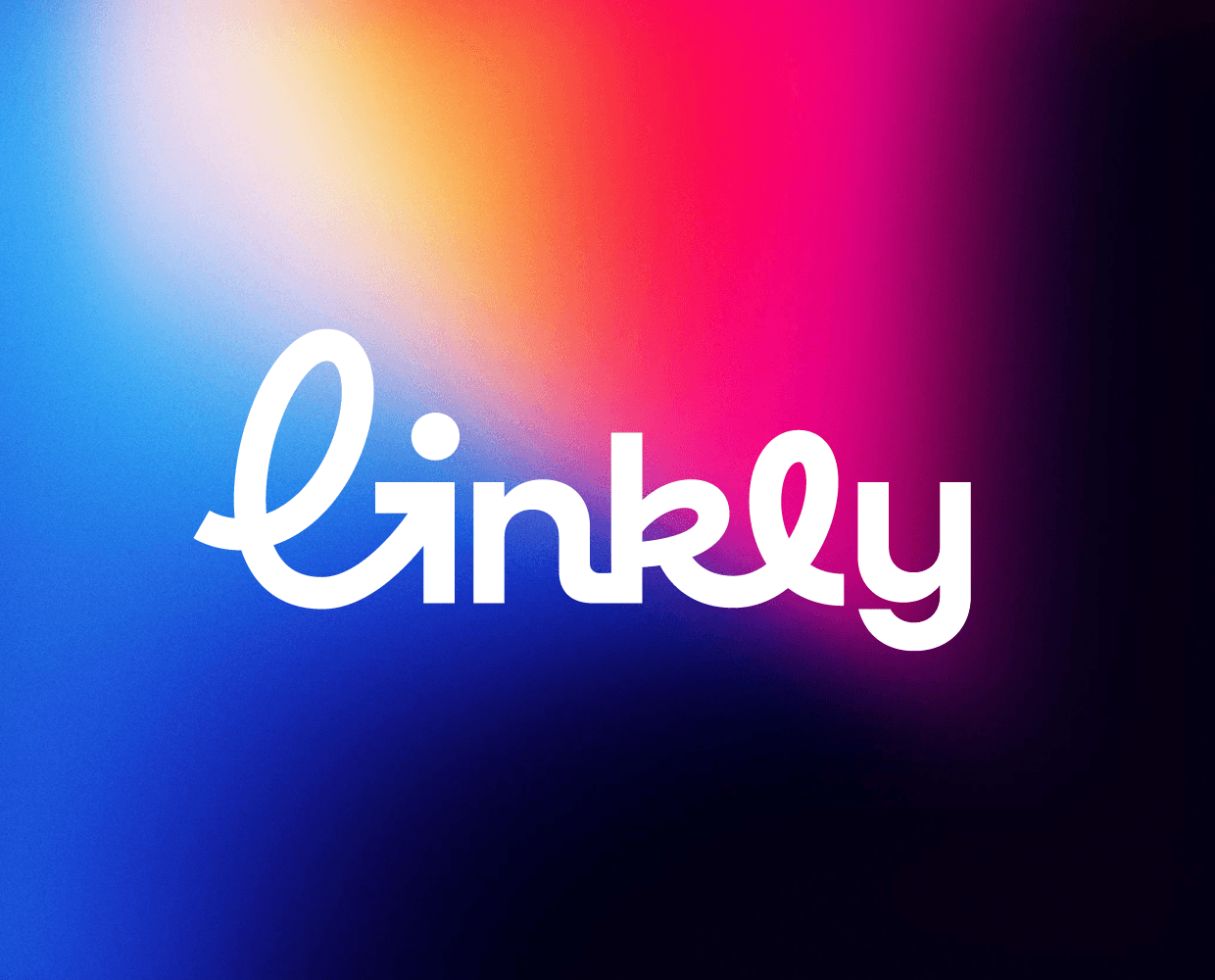
Linkly is a smart link management platform created for marketers and digital teams. The branding was designed to reflect speed, simplicity, and seamless navigation — core features of the product itself. The custom symbol combines the letter “L” with a directional arrow, visually representing smart redirects, movement, and guiding users to the right destination.
The identity system uses a vibrant gradient palette and soft geometric forms to create a modern, memorable, and tech-forward appearance that stands apart from competitors in the link-shortening space. The goal was to build a brand that feels both approachable and professional, scalable from small app icons and QR codes to full digital campaigns and merchandise.
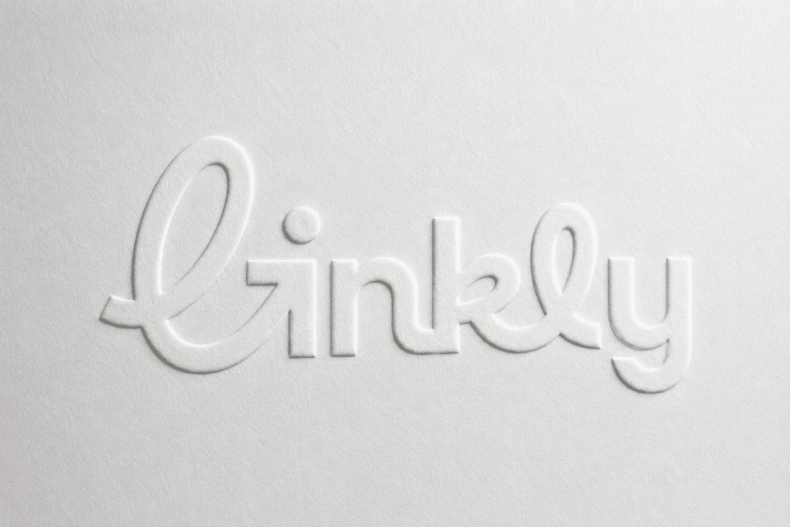
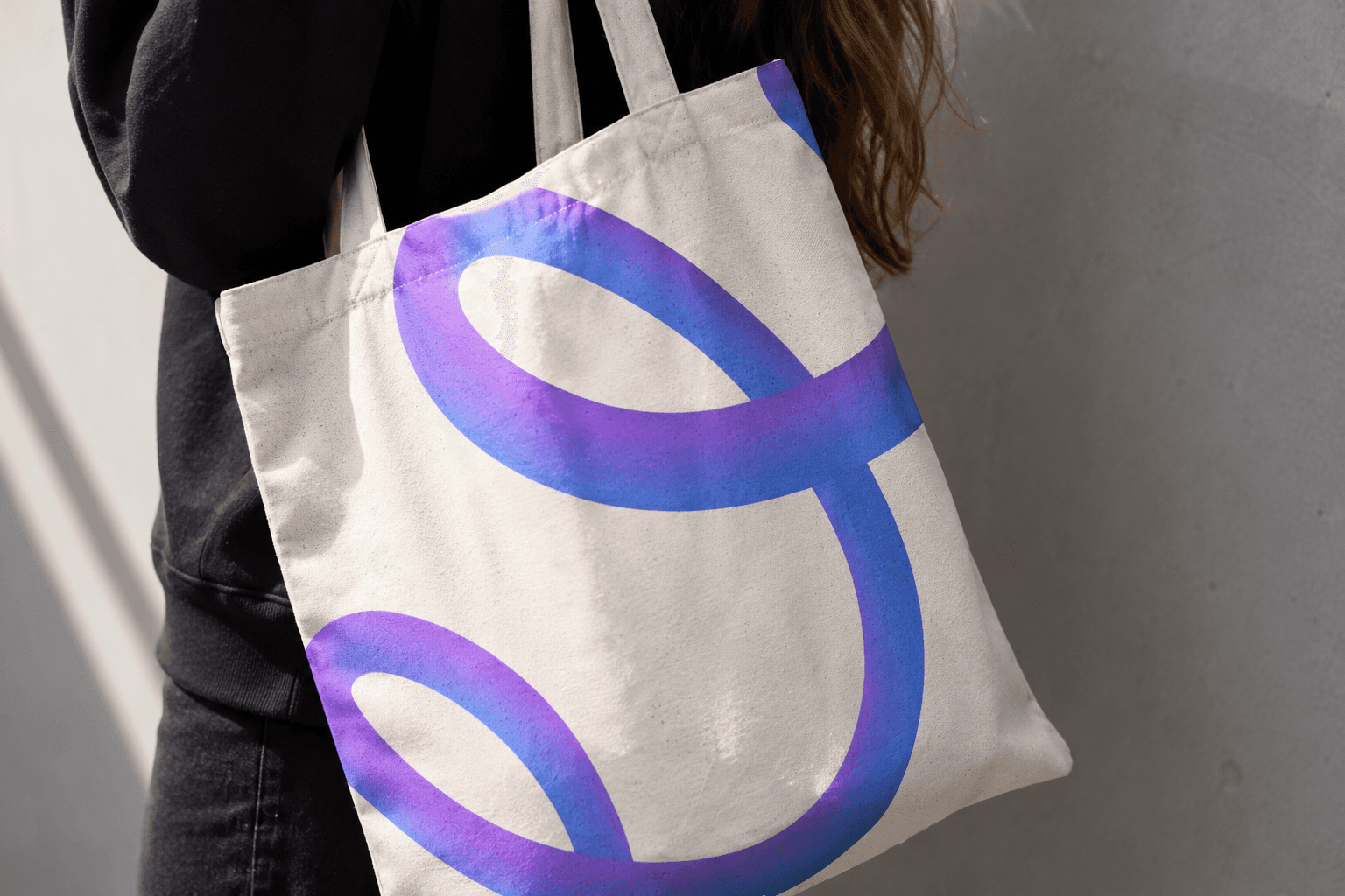
The final visual language balances playfulness with clarity, helping Linkly communicate innovation while remaining highly recognizable across web, mobile, and print applications.