TailwindsPrep
Logo Design
OVERVIEW
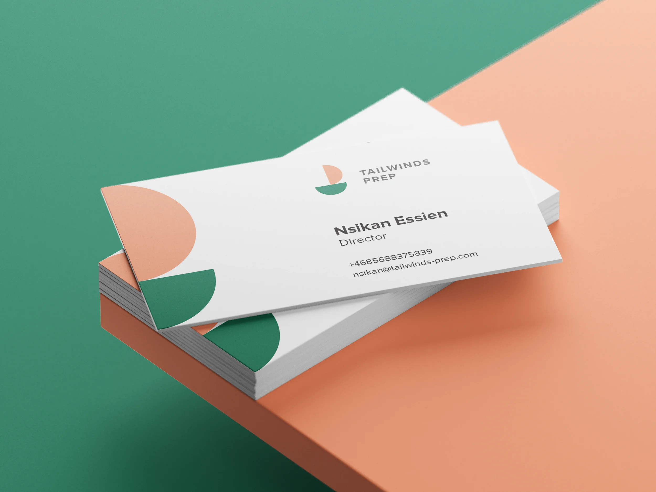
Tailwinds Prep branding was designed to visually represent guidance, progress, and forward movement: core values of an educational consultancy helping students navigate their path toward top universities and future careers.
The symbol is built entirely from two identical circles, carefully combined into a minimalist sailboat form. This geometric approach reflects structure, balance, and clarity, while the sail metaphor directly connects to the meaning behind the name “Tailwinds”, a favorable wind that helps a ship move faster toward its destination. The concept symbolizes mentorship and support, helping students move confidently toward their academic goals.
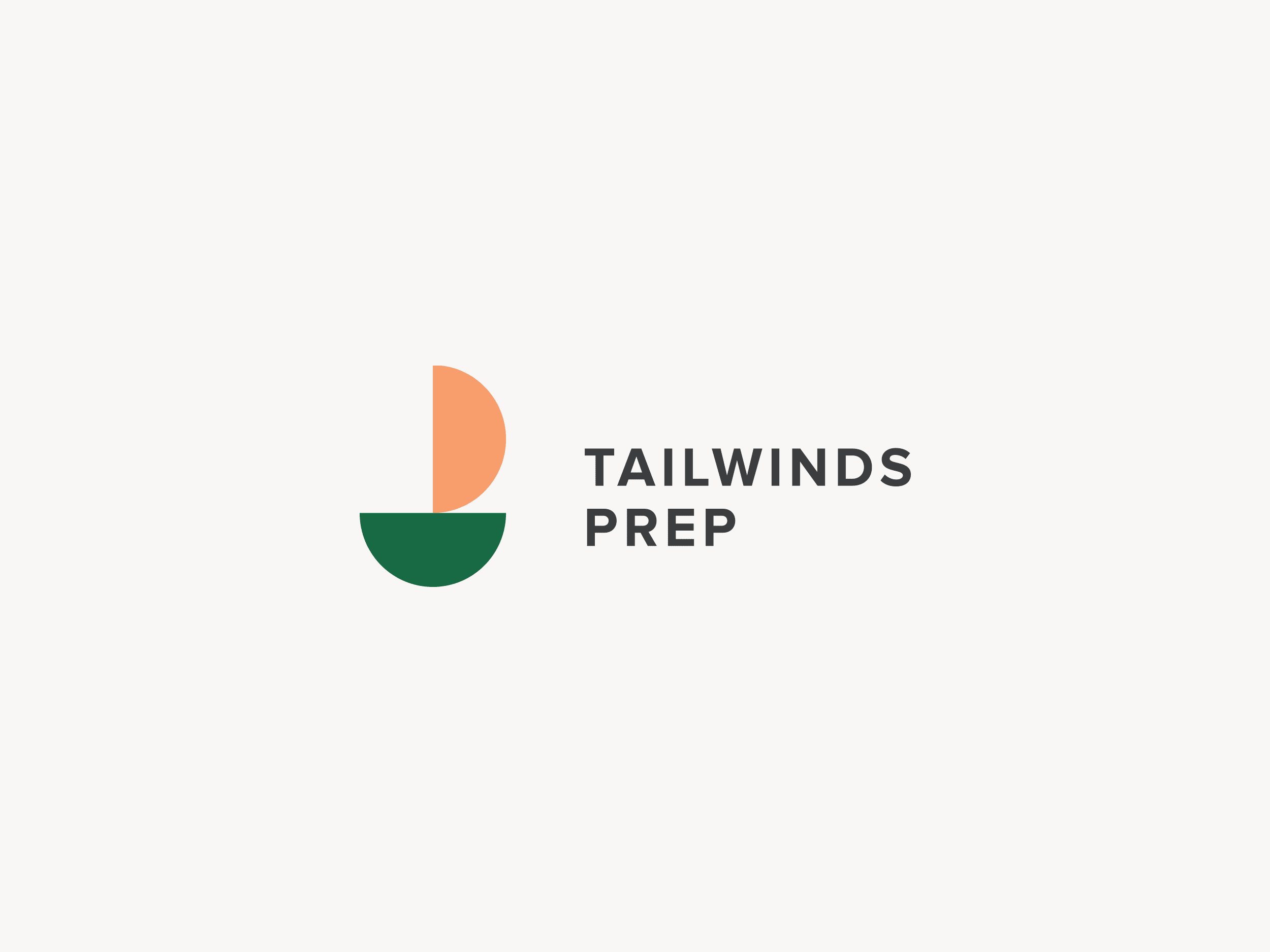

The warm orange and deep green palette creates a balance between optimism and trust, making the identity feel approachable yet professional. The final logo was designed to work seamlessly across digital platforms, educational materials, and branded merchandise, creating a modern and memorable identity for Tailwinds Prep.